A key element in the process of establishing an insights-driven culture in a given organisation is reporting the results within. In the literature review of my PhD I have been looking at case studies, both in the profit and non-profit sector, on how organisations implement a performance measurement system. I have come to the conclusion that having a system for regular reporting as well as the right communication channels are truly crucial factors for the success of this organisational change.
There are different ways of communicating the results and making the data accessible to members of staff. This process can be done in different ways, for instance presenting the results in meetings, uploading evaluation reports on the intranet, sending regular emails with updates or having a dashboard that is timely updated with key metrics. I will be writing a series of posts about this last reporting tool with the aim of discussing about the selection of digital and social media metrics that should be included, looking at some examples from the culture sector, reviewing different types of dashboards (strategic, tactical and operational) and sharing some tools that can help with the task of creating a dashboard.
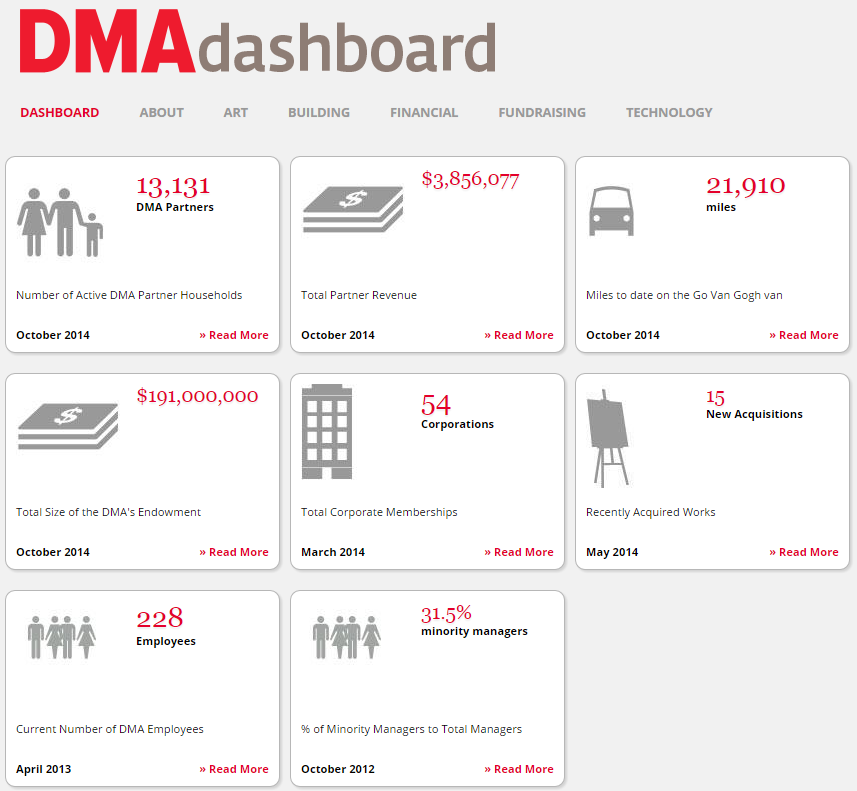
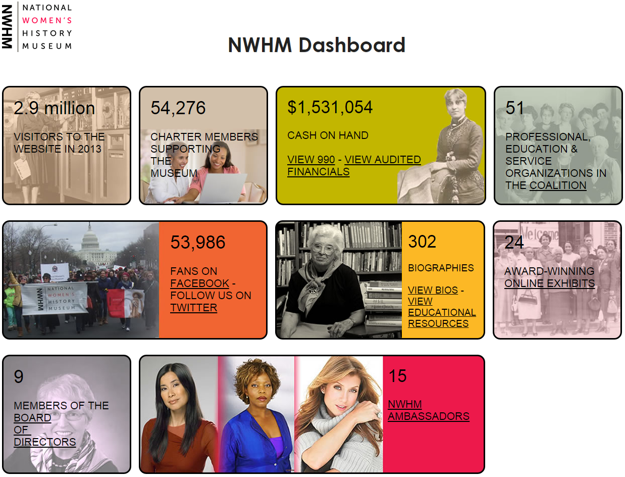
There are clear benefits of implementing a dashboard in an organisation. The Indianapolis Museum of Art has been a pioneer in the field by creating an online dashboard and making its code accessible to everyone. In the IMA blog Rob Stein, former Deputy Director of Research, Technology, and Engagement at the museum, explains how this tool helps to increase transparency, which he defines as ‘the ongoing discipline of practicing radical authenticity and demonstrating to the public whatever degree of integrity and operational excellence our museum possesses at the time’. Now he continues this data transparency work at the Dallas Museum of Art with the publication on the website of detailed data about the DMA friends scheme.
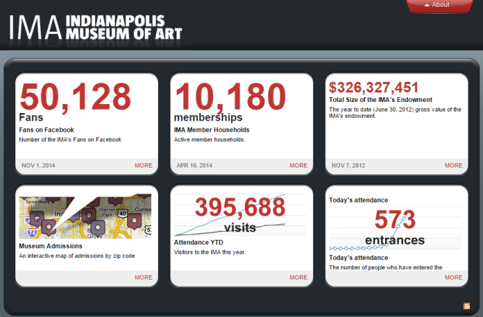
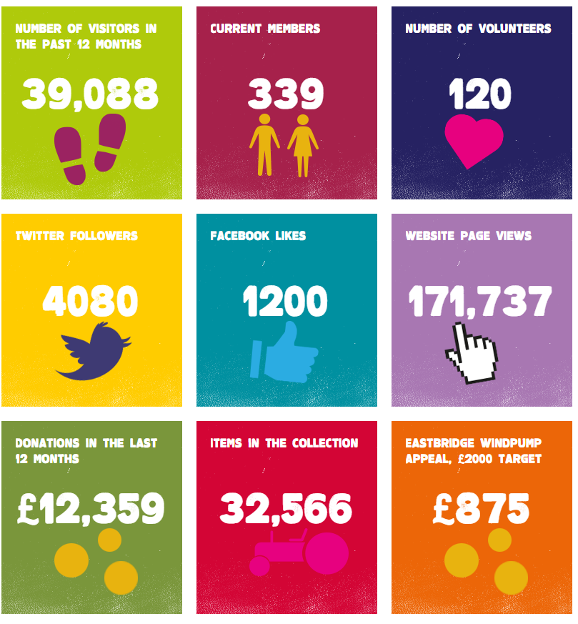
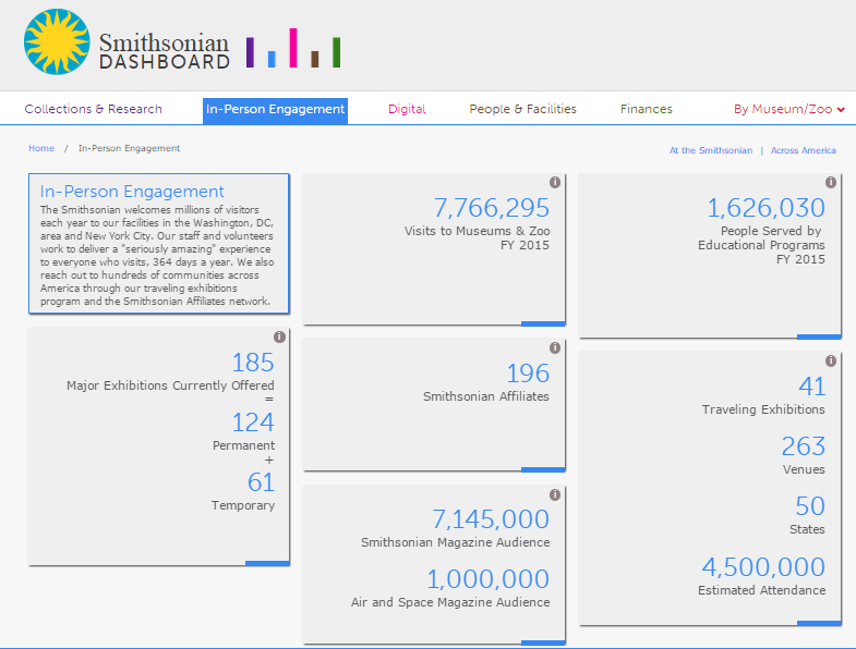
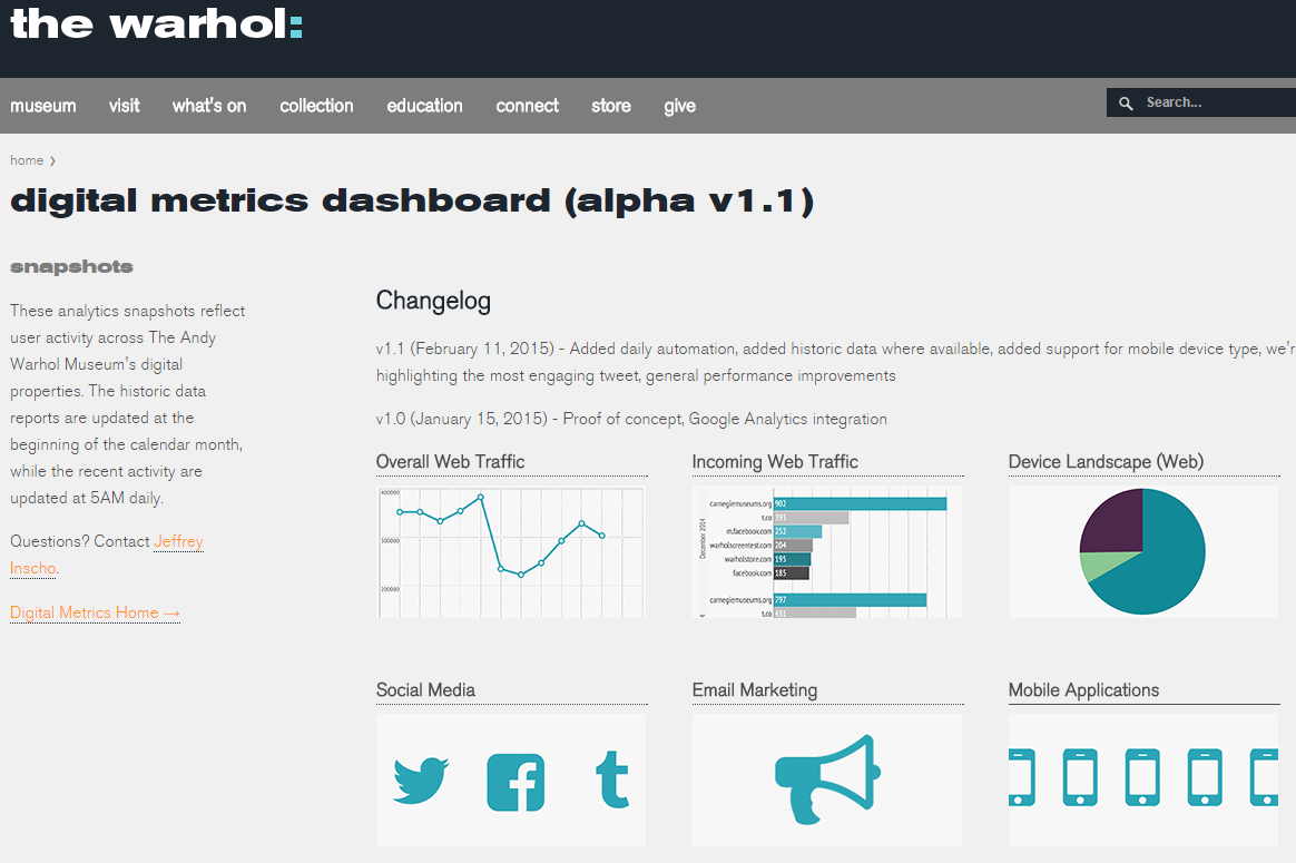
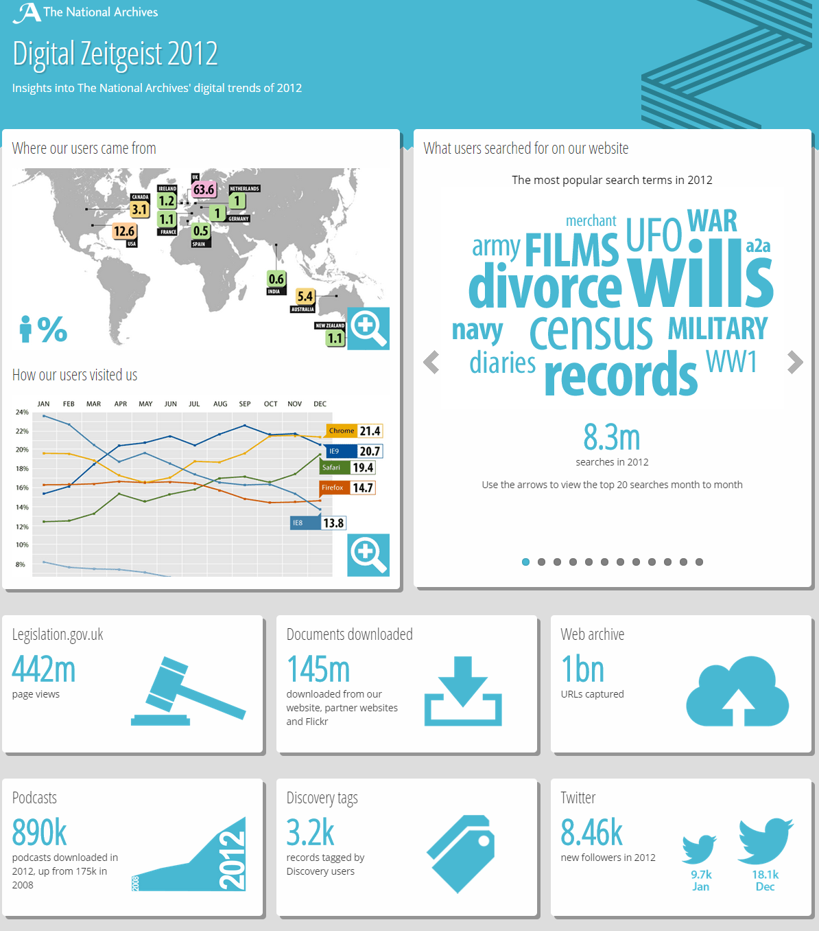
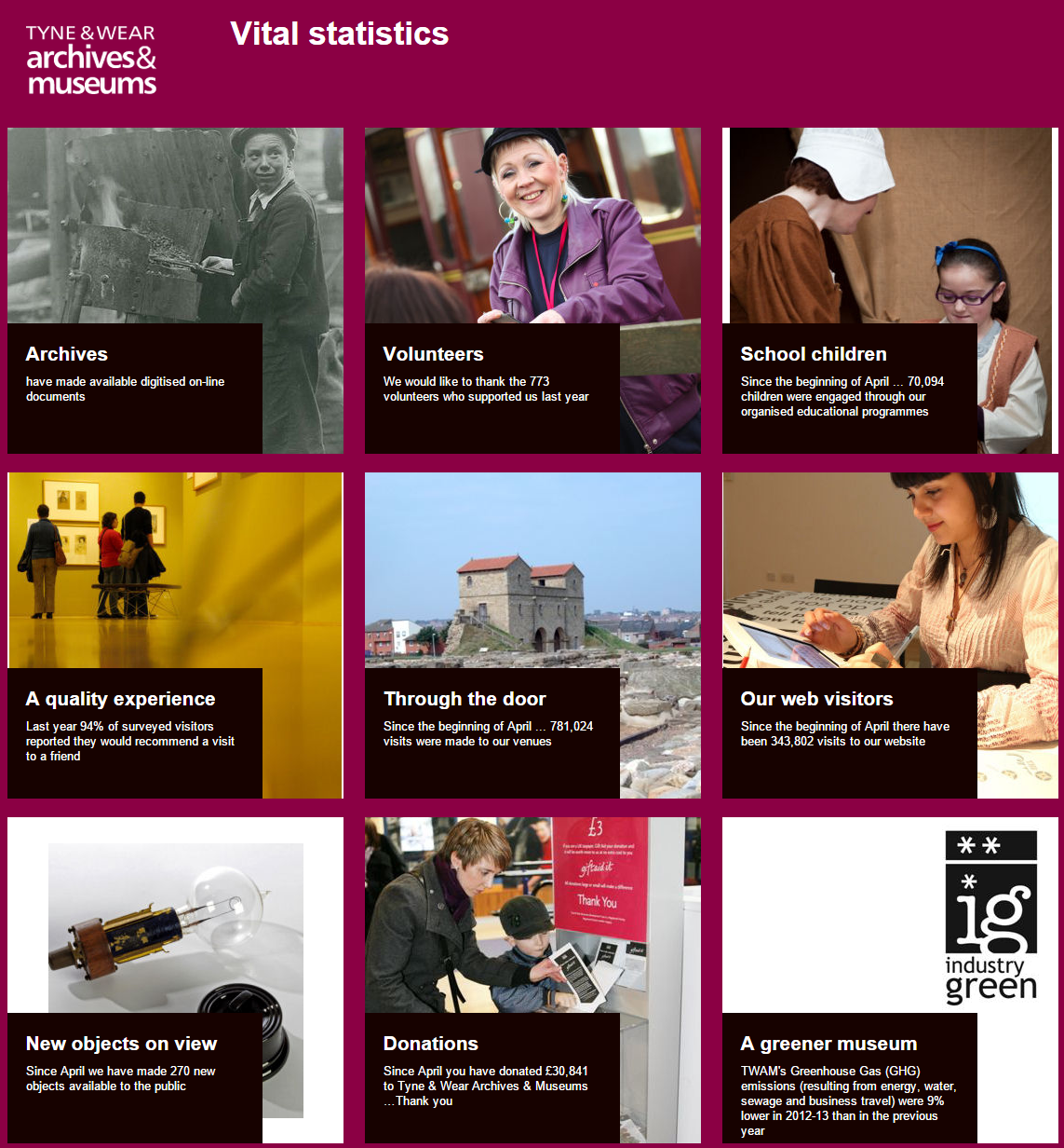
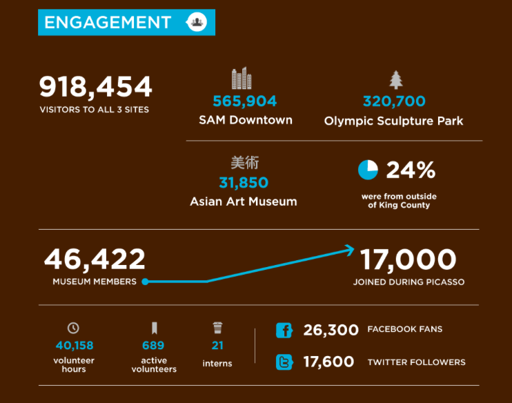
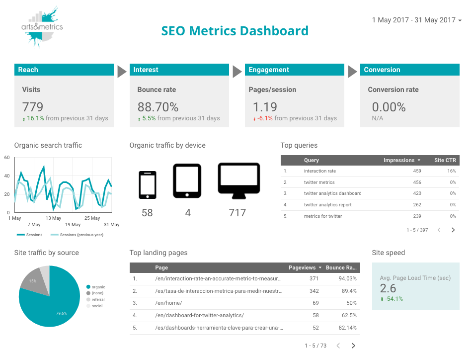
Other cultural organisations have made their dashboards available online. Here is a list of some dashboards I have found but please feel free to add any other you know about in the comments.


The positive effect of having an internal dashboard is that it helps to communicate the strategy and align people working towards the defined strategic objectives. Probably the most difficult task to build a dashboard is to select the few metrics that will be included. And even once they have been selected, there is an expectation gap when comparing the metric requirements to the actual data in a dashboard for the first time and that fosters further questioning and reviewing of the selected metrics by the organisation. The reactions and feedback coming from members of the staff is a very important element in shaping the final version.
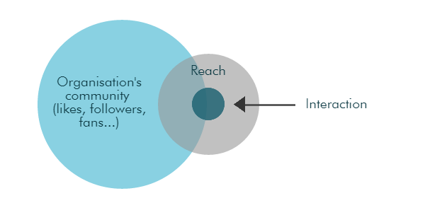
Some of the dashboards in the examples shown in this post include several digital metrics such as website visitors, percentage of digitised objects, Facebook likes or Twitter followers. Does your organisation have an internal or external dashboard? When it comes to evaluate digital performance, what are the metrics included?
Really interesting this. I’ve been been working on a dashboard-related project lately so have been thinking about this rather a lot. Looking forward to reading your thoughts.
I searched for what else was out there and found most (but not all) of the ones you posted, plus http://citydashboard.org/uclmuseums/ and http://dash.clevelandart.org/. I was also interested by the stuff that NPR and GDS have been doing (haven’t got links to hand but let me know if you want my notes).
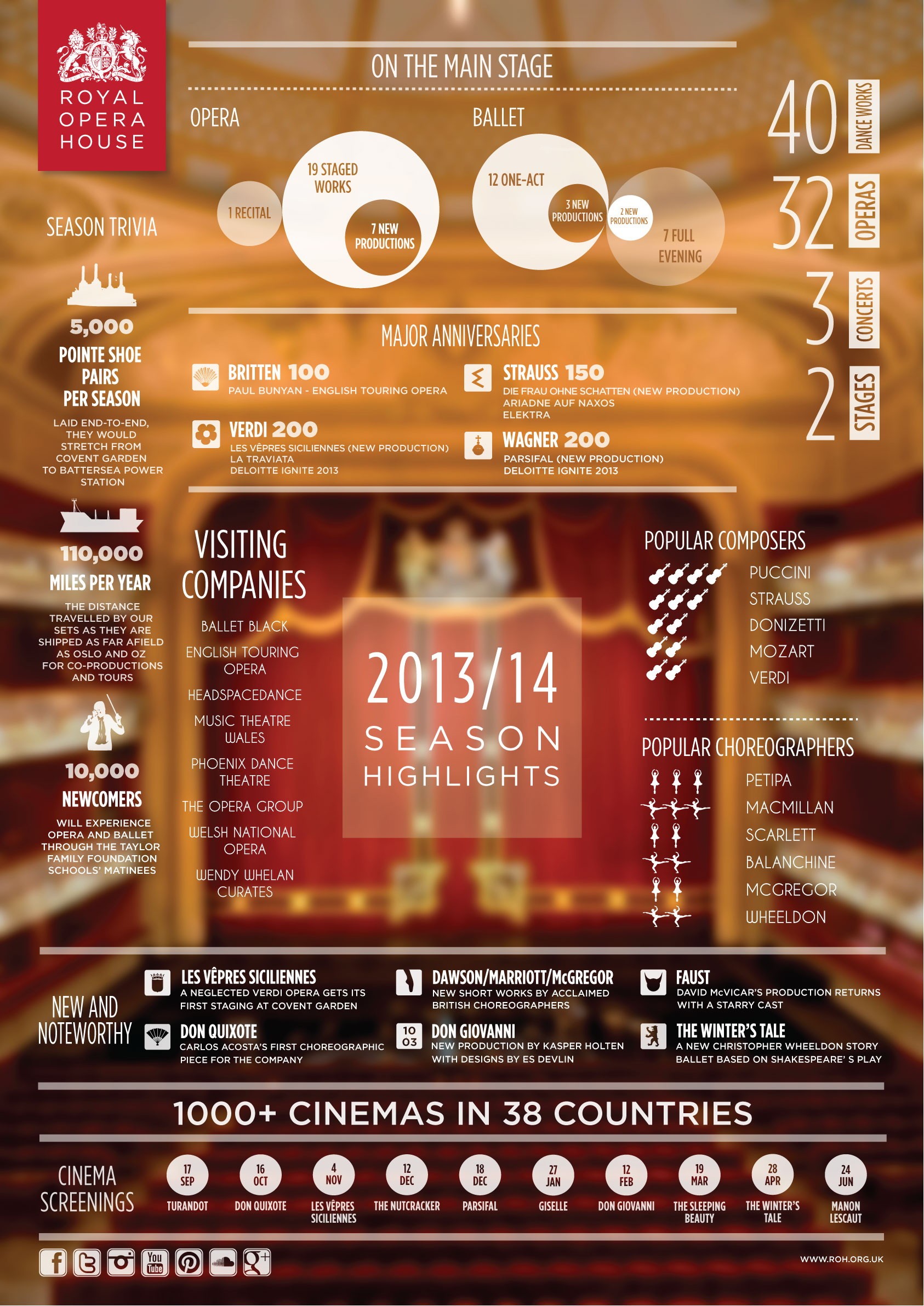
On another tack – I’d describe the National Archives and ROH ones as infographics rather than dashboards. There’s not necessarily all that much difference when looking at a snapshot – the format and production methods might differ, I suppose. Have you drawn a distinction in your research or is the communication of metrics more of an overriding factor with these things?
Last thing – as well as the dashboards stuff, I’d be interested in hearing more about the (other) types of comms you’ve found are necessary/helpful for organisational change.
Thanks Chris for your comment and for the two dashboards you’ve added to the list. It would be great if you could send me your notes by email about the ones for NPR and GDS.
Yes, the ROH one is more an infographic if we define it not just charts but more as static data visuals with some graphics beautifully designed. Infographics are not regularly updated like dashboards but I think it’s interesting that the ROH is producing one for each season with the key facts.
There are other ways of communicating the data from presentation in meetings, regular internal emails, etc. Let’s continue discussing about this in future posts
Europeana have just launched one too:
http://statistics.europeana.eu/welcome
I’m happy to read this. I talked a little about the dashboard in two or three lessons. You can find my slides here.
http://www.slideshare.net/melenabig/museums-in-a-troubled-age-070514-costruire-lidentit-digitale-di-un-museo
This is fantastic to see all these dashboards. Two things I would like to see as next steps:
1) The numbers are great, but the numbers are even better when they are compared against something. One thing to compare numbers against is time. I’d love to see the velocity of growth of facebook fans. Or how a museum is growing membership.
2) A second thing to compare the numbers against is other museums. Just how much is one museum growing against another?