
In August Twitter made their analytics tool available to all users. Twitter Analytics gives access to a whole bunch of metrics of each of your tweets as well as some data about your followers such as location, interest and other accounts they follow.
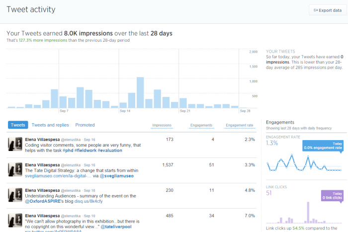
For each one the tweets you get the following information:
- impressions – number of times a tweet is displayed to users
- engagements – total number of interactions (replies, favourites, retweets, clicks on links, hashtags, username, images)
- engagement rate – engagements divided by impressions
These metrics are very useful to understand the reach of your content and also the type of interactions it gets. However, the Twitter Analytics interface has some limitations when it comes to visualise trends and monitor changes overtime. The interface only shows the last 28 days data. The only option currently available to look at past activity is to download the data of your tweets in a csv file.
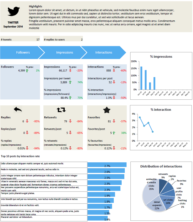
As part of my PhD fieldwork at Tate I have created a dashboard in a spreadsheet to facilitate the task of turning all those rows of tweets and data into a visual that helps to analyse the performance of a Twitter account overtime. The dashboard includes the following metrics:
- Tweets
- Followers
- Impressions as total volume, per tweet and in percentage of the total followers
- Interactions: total volume, per tweet and in percentage of the total impressions
- Distribution of the interactions
- Replies
- Retweets
- Favourites
- Top 10 posts based on the interaction rate
The dynamics to create this dashboard is to copy the data from the file you download from Twitter Analytics and paste it to the corresponding month on this spreadsheet. You just need to change the month in the dashboard, then some magic happens and automatically the dashboard is updated, all the numbers and graphs have now the last month’s information. There are some detailed instructions in the document on how to update the spreadsheet.
Twitter Analytics dashboard template (Excel, 9KB)
The idea of this dashboard is that the reporting is done quickly so time is spent doing the analysis with also a more qualitative look at the data such as replies and conversation generated. Moreover, the flexibility of the spreadsheet allows to add or remove graphs and customise the template with your brand colours and logo. If you try this Twitter analytics dashboard template I would really like to hear what you think. Also if you tweak the template for your own organisation it would be great if you could share it too.
I would like to thank John Stack, Head of Digital, Kathryn Box, Tate Kids Producer and Jen Ohlson, Tate Collectives Producer for their feedback during the process of creating this dashboard.
UPDATE July 2015: I am finishing my PhD research and I would like to gather some feedback about the usage of this dashboard to include it in my thesis. It would also help to improve future versions of this dashboard. If you have been using it please send your comments via this feedback form. I hugely appreciate it. Thanks!
UPDATE August 2015: I have received several emails and comments about how to update the excel from May 2015. One way is to add a new sheet (Jun15) and add a new column copying the formulas from a previous month. This way you keep the historical data but you need to update the formula in the charts to be dynamic based on the past 12 months or update them on monthly basis adding the data source. Here is the dashboard excel updated for June15. In orange you will find the cells to be updated with “Jun15” and the rest you can just drag the formula from the previous month.


hey, just got the file – looks great!
gonna fill in the numbers and see how it goes – thanks for making the time and effort in this.
Extremely helpful! thank you for sharing this!
Very helpful! Although finding it tricky to refigure the table for new months of the year.
you are a magician and this report is your magic
Thanks for creating this! But… I’m having a technical issue now that we are past the scope of the table. How do you change the dates/formulas to recognize past May 2015?
Hi Avra,
Thanks for your comment and for using the dashboard. There are two options:
1. You delete Jun and then Jun-14 becomes Jun-15. You move the June column to the end.
2. You create a new tab (Jun15) and then add formulas to the new column. You keep this way all the historical data. However, in this case you will need to update the chart formulas or select the new range every month.
Hi,
Great spreadsheet! I’m new to Excel so I’m not sure how to update the chart formulas or select a new range each month. Could you provide more description, please?
Thanks!
.j.
Hi Elena ,
This seems very helpful. Thank you for taking the time & effort and more importantly sharing this knowledge.
I read the instructions. Just to confirm , I can use/share this doc adding my data as long as I cite common license as the source right?
Thanks,
Soumya
Hi Soumya, Glad you find this template useful. Yes, feel free to use the form in your organisation and make any modifications to adapt it to your reporting needs.
Thank you so much Elena.