As we saw in the previous post about dashboards, the visualisation of the metrics and the way to present them within the organisation plays a very important role to create and support a data-driven culture. There is a diverse range of tools available on the internet that can help with the task of creating these visuals. There are some requirements that may need to be considered when choosing the right tool, for instance, automation of data updates, connection to different data sources, IP or password restriction for internal dashboards, options to add text, type of charts available, colour customisation or sharing and export format options.
In my PhD I have been using different tools to create visually appealing charts that will hopefully impress my future examiners. Here in this post I compiled a list of some of the tools I have used. By the way, none of them sponsor my research, so I am not trying to promote any tool in particular. However, some of them have very good discounts for students and non-profit organisations so it is worth checking this out.
“The commonality between science and art is in trying to see profoundly – to develop strategies of seeing and showing”
— Edward Tufte, The Visual Display of Quantitative Information

If resources are limited, there are free solutions available, as simple as creating a dashboard on Google Drive. You can generate some charts in a spreadsheet and then export this document as html or click on the option “publish to web” which will generate a link to access the dashboard or an embed code. Then, every time you make changes to the data on the spreadsheet the published dashboard gets automatically updated. For Google Analytics there is a specific add-on to build dashboards using spreadsheets.
There are other tools you can use to create simple charts that you can embed on a webpage:
- Data wrapper – open source tool that allows you to create charts in a few steps and then get a code to embed the chart on a web page –
- Google charts – with some development skills you can create graphs which are updated automatically in real time
- Raw
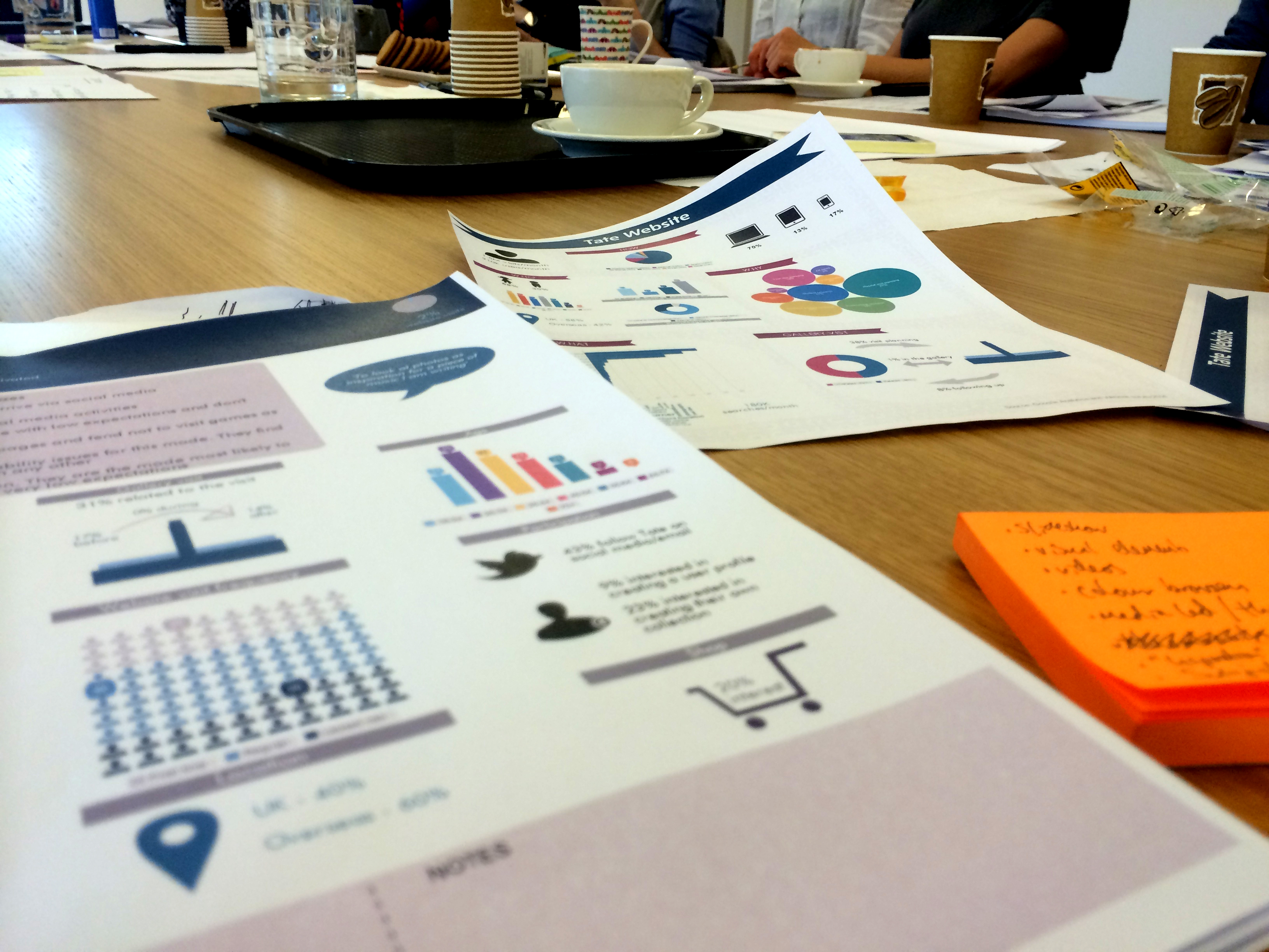
Telling the story behind the data can be done with some design to it. There are various online tools to create beautiful infographics where you have options to add charts, icons, arrows, symbols and other visual elements. You can also customise it with your logo and brand colours. Here are some infographic tools:
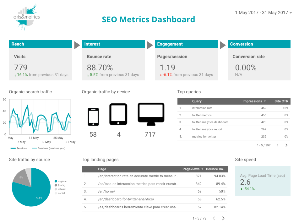
More advanced tools allow you to bring to a dashboard data from different sources such as Google Analytics, Facebook, Twitter, email etc.
- Google Analytics apps – If you are a frequent user of Google Analytics there are different apps that will make the reporting task easier automating your key dashboards normally pulling the data directly into a spreadsheet.
- Tableau – this is a really powerful tool that you can connect to different data sets. Is a very user friendly tool and it allows you to create charts in a very interesting fashion as you can explore the data in many different ways.
- Ducksboard
- Geckoboard
- Chartio
- Dash This
- Silk
So these are some of my tools, which ones do you have in your toolkit? What are the characteristics you look for in a data visualisation tool?

One thought on “Time to tell some data stories! And here are some visualisation tools for it”