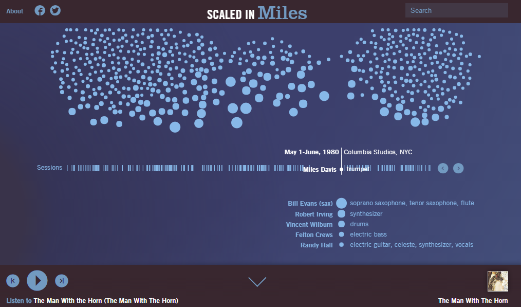
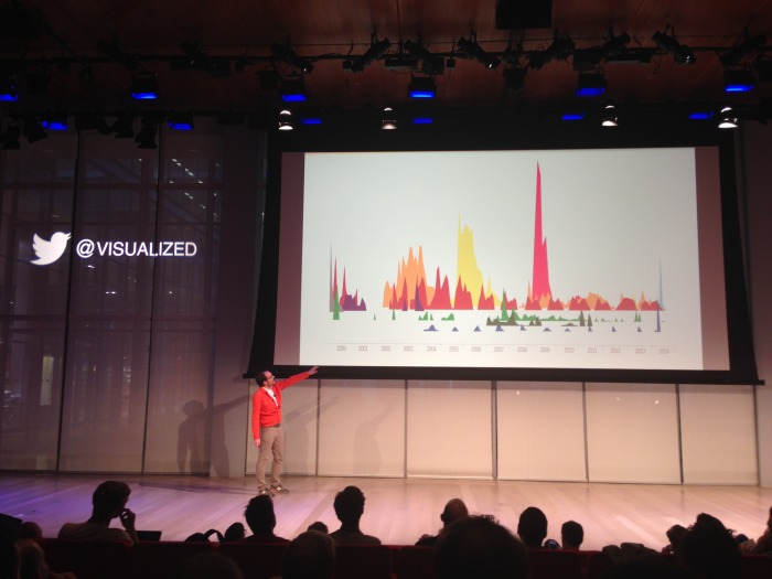
Last week I attended Visualized, a conference held in New York about data visualization. Data can be presented is so many different ways and every subject can be analysed and interpreted from many angles. The range of visualizations presented at the conference was huge and included charts, infographics, interactive websites (e.g. Miles Davis career, Meet Thomas Drake), exhibitions (On Broadway at the NYPL), performances (“A sort of joy” based on MoMA’s collection database), installations (e.g. Lifeline), videos (Rosetta’s mission, Tetris of debt and expenditure) or art pieces (Sculptures by Adrien Segal).
Key trends mentioned during the conference are:
- Open data: there is an increasing number of initiatives that allow everyone to access both public (e.g US’s government data, NYC data) and private data (e.g. Google search data).
- Data journalism and how to use visualizations to tell data news (see below projects presented by Al Jazeera, NYTimes, WNYC).
- Data science democratized: With the new tools that are coming up people with less technical skills will be able to produce interactives and cool visualizations. These tools are making data visualization accessible to anyone. There are also more open source tools available and some examples mentioned during the conference are: OpenSteetMap, Lichen Platform, CartoDB, Processing, R.
- Real time data: Visualizations with live data have a huge impact as they give greater access to what is happening in real time. Google Tends now offers real time data of what people are searching. Some other sites mentioned by the speakers are the Wind map that can be used to follow hurricanes or check surfing conditions and the Live Subway agony index that connects to live data of the MTA. Companies also need information to act as soon as possible on data findings (see the LA Dodgers digital trading room)
- Bid data: Many of the projects presented were based on big data, sets of information coming from millions of data points. However, people talked about the limitations of big data and the need for a human element to tell the stories.
Here are some links to projects presented during the conference:
- Cycling Injury map of NY
- Taxy trip speed
- Other projects can be seen on the I Quant NY Tumblr
- Bloomberg Graphics: What’s warming the world
- US Gov open data
- Project open data dashboard
- France Gove open data
- Map give
- Federal spending transparency, data act

- Datacomb tool
- Lichen – new visualisation tool to be launched soon
- Tool: CartoDB
- Google Trends
- Google Trends Github page
- A world of change: climate change through the lends of Google search
- Artworks based on data
-
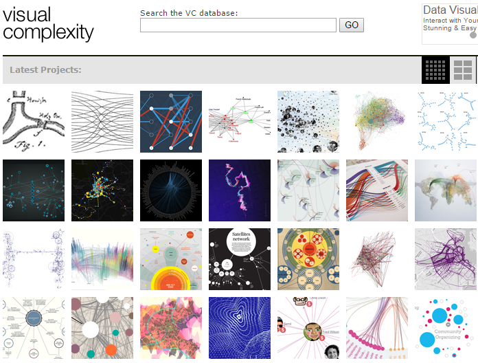
Visual complexity – database of data visualizations projects
- Analysis of 10 years of visual complexity.com
- Blogviz
And another highlight of the conference, data visualizations cakes, yummy!